The Desert Spoon Project holds a special place in our hearts because it is the personal home of our owner and lead designer, Maegan Blau. This home serves as a living design laboratory where we test, refine, and evolve our approach to accessible interior design. We are re revealing the project to share recent improvements that continue to shape how the space functions and feels.
The home reflects Maegan’s modern Southwest design style, rooted in a deep respect for the desert landscape. Material selections and color palettes draw directly from the surrounding environment, blending warm earth tones with layered textures and intentional contrast. Every detail balances beauty and usability, creating thoughtful moments throughout the home.
Accessibility remains central to the design. As a wheelchair user for over twelve years, Maegan designed the space to fully support daily life while maintaining a refined aesthetic. The home also accommodates her husband, Chris, who stands six foot four, making it a strong example of adaptive design for multiple heights and mobility needs. From kitchen layouts to custom storage, each decision proves accessibility can serve everyone without compromise.
The Desert Spoon Project demonstrates how barrier free design integrates seamlessly into a modern home. It supports Maegan, Chris, and their dogs, Odin and Luna, while offering flexibility, comfort, and longevity. We invite you to explore the project and follow along as future posts dive deeper into the design solutions behind this accessible modern Southwest home.
__
CLICK HERE FOR THE FULL PROJECT PORTFOLIO
PHOTOGRAPHY BY: LIFECREATED PHOTOGRAPHY
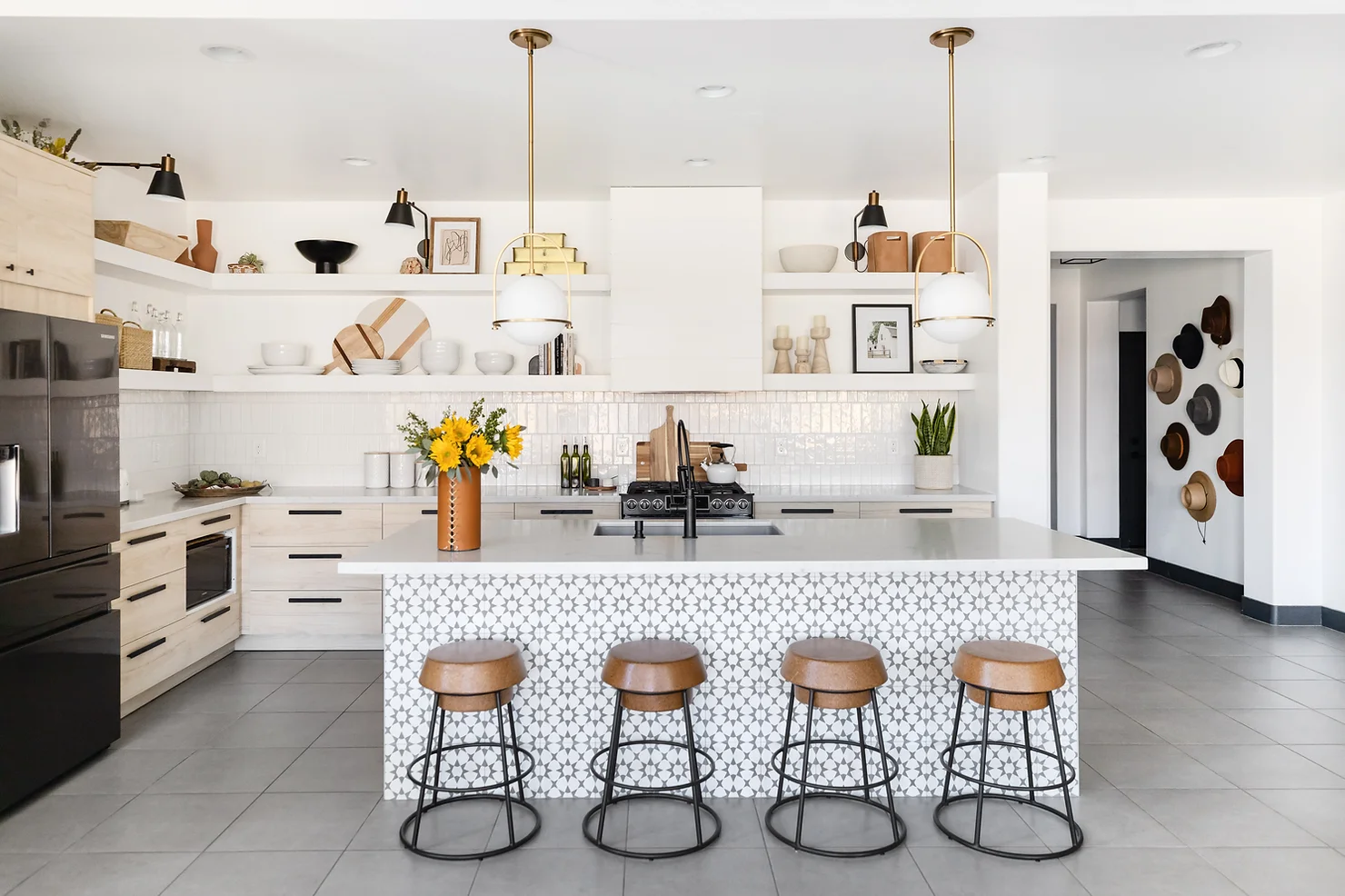
KITCHEN
The heart of the home lives in this kitchen, and it truly delivers. Originally, the space was a builder basic kitchen with dark cabinetry and dark granite countertops. From the start, Maegan envisioned something brighter, layered, and far more intentional. The goal was to create a light kitchen with strong contrast without relying on white cabinets. We emphasized the element of line to achieve this look. Strong horizontal lines ground the space, while subtle vertical details add balance. Curved elements soften the layout and guide the eye throughout the kitchen.
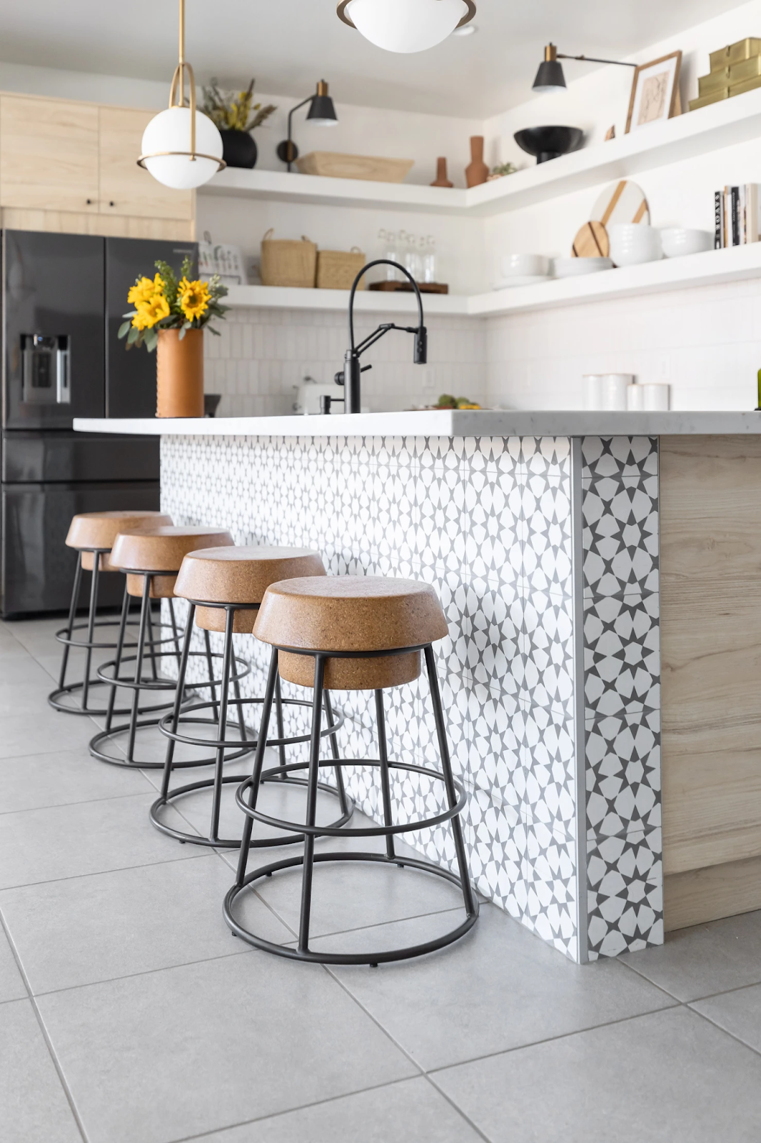
Accessible kitchen design guided every major decision. We selected drawers for all lower cabinetry to improve reach and usability. The microwave moved into the lower cabinets for easier access, and a cabinet tower beside the refrigerator maximizes vertical storage. A slide in range supports accessibility while maintaining a clean, streamlined appearance.
Since cooking is not the primary focus for the family, storage took priority. The kitchen needed to function for Maegan at seated height and her very tall husband. Adaptive storage solutions support comfort and independence for both users. When certain areas were harder to access, we turned them into intentional design moments. The chunky open shelving provides storage for rarely used items while adding personality and visual interest. These shelves transformed the kitchen from basic to extraordinary.
__
“My favorite part of the kitchen is the cabinet tower next to the fridge. It offers so much accessible storage, really smart space planning and the best part there is an outlet in the cabinet so I can keep my ugly small appliances off the counter.”


LIVING ROOM
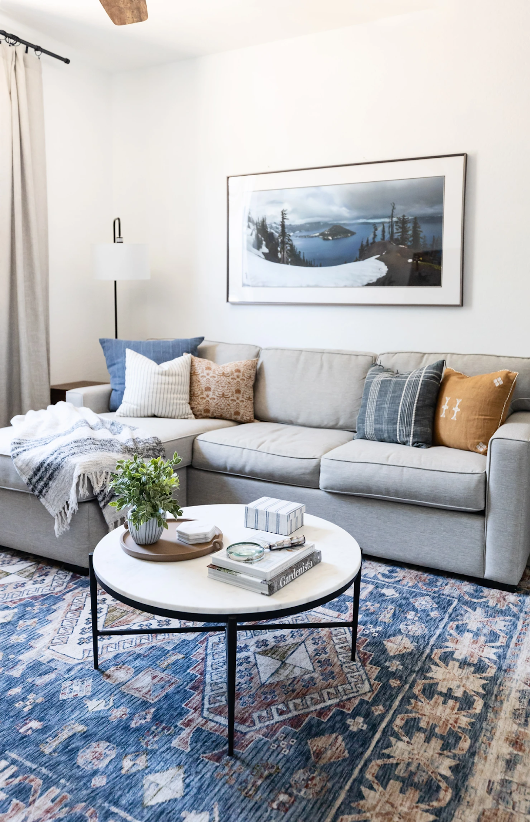
Drama, comfort, and texture define this living room design. The space showcases accessible space planning that balances function with elevated style. From the beginning, the furniture layout allowed Maegan to move easily around the entire coffee table without obstruction. Each furniture piece was also selected at ideal transfer heights to support comfort, safety, and independence.
The push back recliners challenge traditional ideas of what a recliner looks like. They provide everyday comfort while maintaining a refined, modern feel. A leather sofa topped the wish list, and the camel leather delivers with a rich patina that will only deepen over time. These seating choices bring warmth, durability, and character to the space.
The painted black wall serves as the showstopper of the room. Simple yet powerful, it anchors the design without overwhelming it. Instead of a traditional television built in, we kept the wall clean and visually restful. This approach allows the design elements to shine while maintaining a calm atmosphere. Wood accents soften the contrast between black and white, and layered neutrals create depth and balance. The result is a living room that feels bold, comfortable, and thoughtfully designed for accessible living.
__
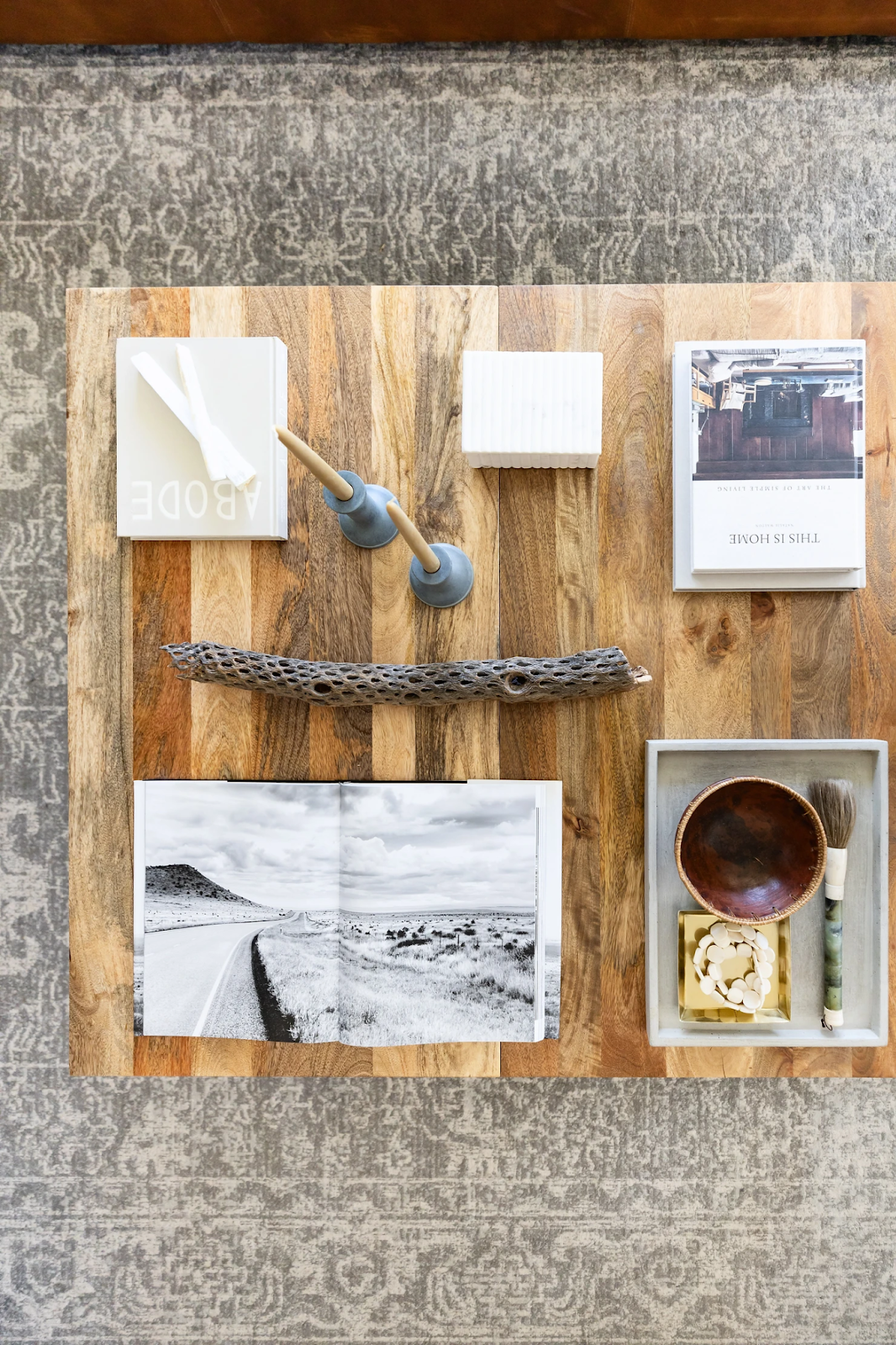
“Choosing a favorite part about this room is tough. I really like my oversize coffee table, I change up the accessories often and it is quite literally a styling laboratory for me. But I also really love my Samsung Frame TV. Having the option to have both art and TV is perfect and really makes me smile every time I am in here.”


DINING ROOM
This dining area focuses on balance, flow, and accessible space planning. We softened contrast and emphasized blending by mixing straight lines with subtle curves. This approach creates visual interest while maintaining a calm and cohesive feel. Every design decision supports both function and beauty.
Space planning played a critical role in this accessible dining room design. The layout ensures Maegan can move her wheelchair comfortably around the entire table and access the credenza with ease. Clear circulation paths allow the space to function effortlessly for daily use and gatherings alike.
Because Maegan remains seated in her wheelchair while dining, we intentionally keep a chair removed from the head of the table. This creates a seamless dining experience while maintaining visual balance. The removed chair becomes a styled corner moment and easily converts to extra seating when family and friends visit. This thoughtful approach highlights how accessible design solutions can enhance both usability and aesthetics in a modern home.
__
“I love the way my dining room came together. The simple layers, the blended colors yet contrasting materials makes it really hard to choose a favorite part. I would have to say the light fixture really makes my heart sing though, I love the unexpected shape and style and the fact that it kind of looks like a UFO.”


GAME ROOM
This is where all the fun happens. We designed this space to boldly tie together the colors used throughout the home while creating a room that feels playful and personal. The first source of inspiration came from a photograph Chris took of Crater Lake, one of his favorite national parks. That image set the tone for the color palette and mood of the room.
Because this is the dedicated video game and hangout space, we incorporated design elements that speak directly to Chris. The sofa pulls double duty by converting into an extra bed for guests, making the room flexible and functional. A custom TV console provides hidden storage for board games and movies, keeping the space organized without sacrificing style. The rug adds a vibrant layer of color and features an updated Southwest motif, grounding the room and reinforcing the home’s overall design story.
__
“My absolute favorite part of this room is our vintage Arizona Highway magazine display. I found these in a thrift store and hoarded them for years until i had the perfect idea of what to do with them. When I pulled them out I saw I had 11 copies, one of every month except December. I quickly hunted a December issue down and completed the set. The covers are so gorgeous i wanted to display each and every one of them in an organic way. I was inspired by the idea of a community news board and decided to try just clipping them and pinning them to the wall in calendar order. The whole display including the magazines cost less than $30 and it flexed my creativity.”


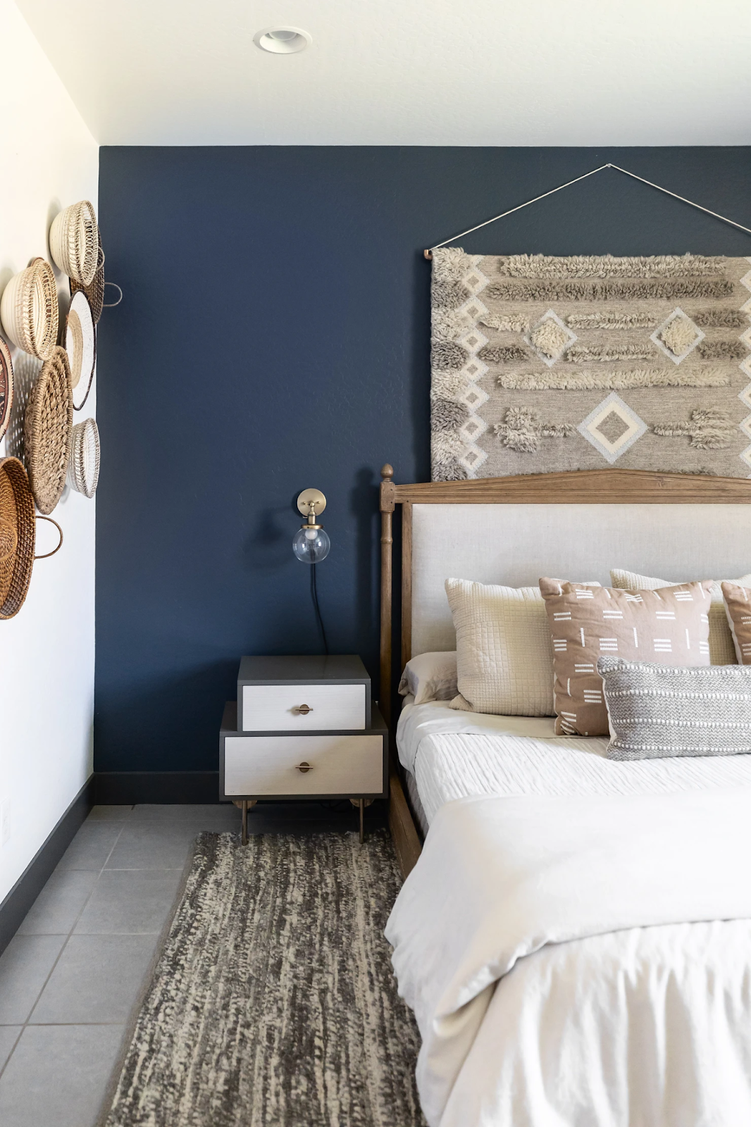
PRIMARY BEDROOM / BATHROOM
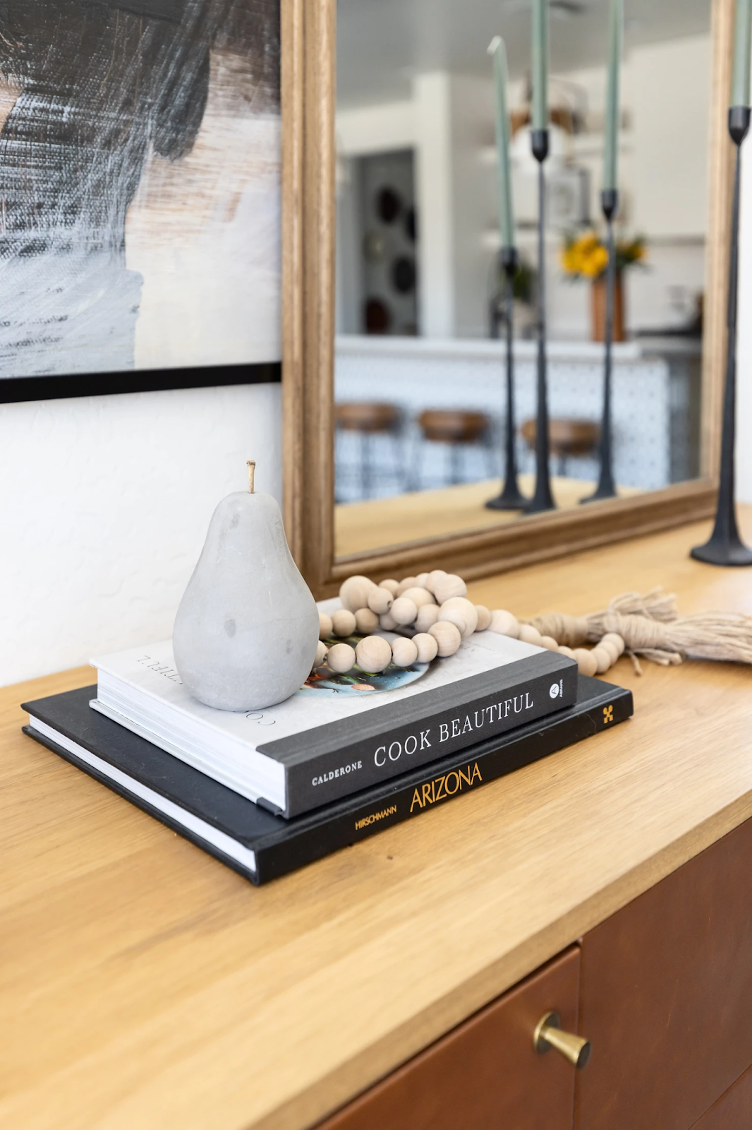
We love a bold blue wall, and this one set the tone for the entire bedroom design. This wall became the starting point for the space and guided every decision that followed. The vintage rug hanging behind the bed was a happy accident after it did not work in another room. Instead of letting it go, we transformed it into a textile tapestry using a DIY hanger made from rope and copper pipe. The added texture and warm tones bring depth and character to the room. Soft ivories and taupes repeat throughout the space to create a calming, cohesive feel, while the basket wall adds a rich layer of texture.
The bed was custom adapted to achieve the perfect transfer height for Maegan. We selected a wood frame we loved and carefully cut the legs down to the exact height needed. Adaptive furniture design often requires creativity, and this solution delivers both function and style.
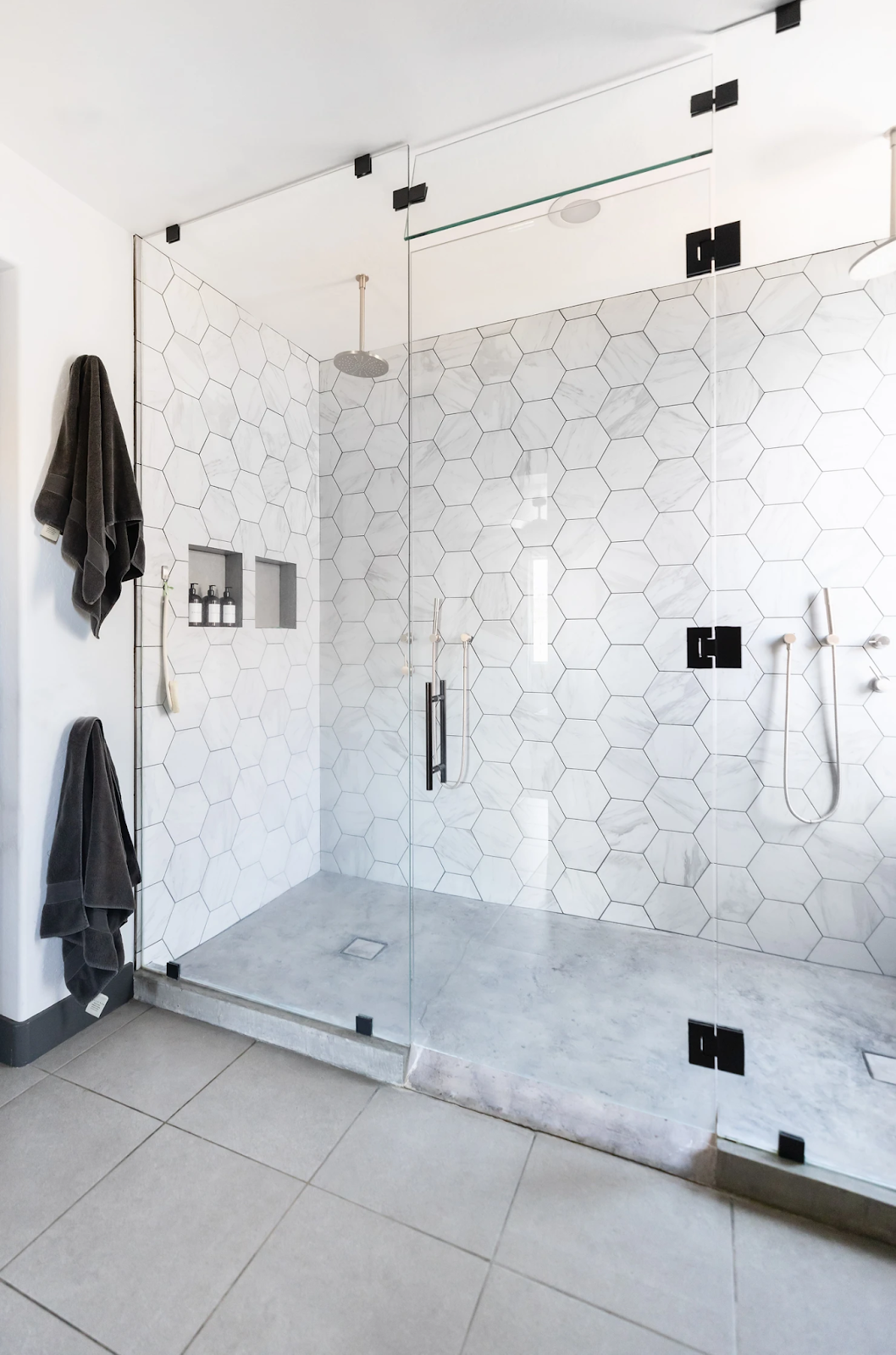
The bathroom was designed inch by inch with accessibility at the forefront. We removed the garden tub to create a spacious his and hers shower, expanded the water closet for easier transfers, and added a barn door for privacy. A roll under concrete sink, angled trough sink, and built in storage support independence while maintaining a refined look.
__
“My bedroom and bathroom are an absolute retreat and I appreciate everyday how perfectly accessible they are for me. Every detail was perfectly planned to ensure I had the best possible set up for me and the whole space really speaks to my personal style. My favorite part of my bedroom is the gallery wall of Chris and I’s wedding photos, I just getting a glimpse of those everyday. The favorite part of my bathroom is probably the metal wall the barn door is on. It actually happened by mistake but it turned out so well that it was the best mistake we could have made.”


__
CLICK HERE FOR THE FULL PROJECT PORTFOLIO
PHOTOGRAPHY BY: LIFECREATED PHOTOGRAPHY


